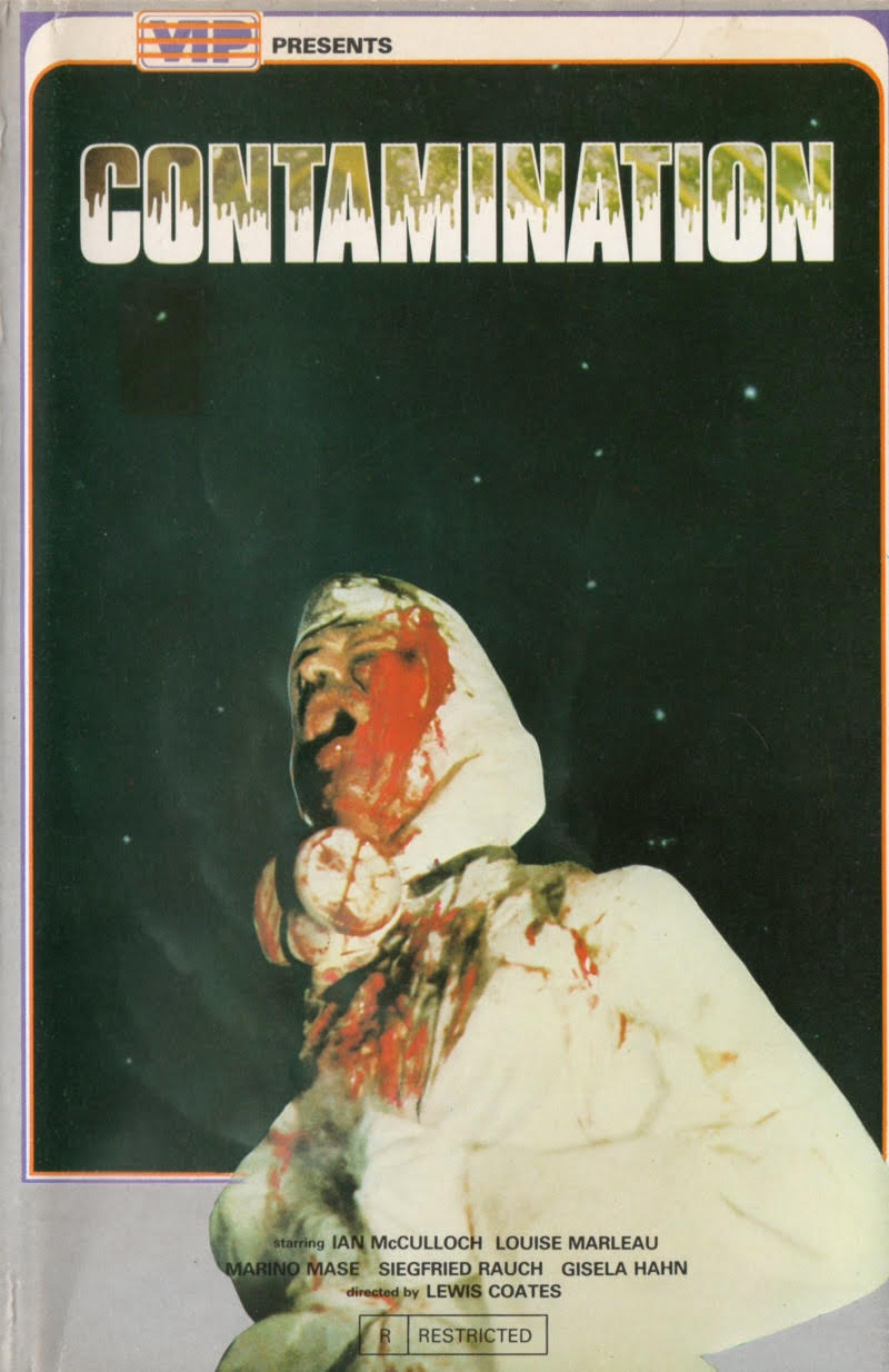
Those of you who have been following my latest posters of the week will see that I am affording more focus to VHS covers of late. It strikes me that I like different covers for so many different reasons. There is no singular aesthetic principle that draws me to one style over another. It may be due to amazing design characteristics, brilliant illustration, terrible execution or, as is the case here, I may be attracted to a cover for its ugliness. I am quite a fan of Luigi Cozzi’s wonderful gem, Contamination. It’s a solid film worthy of one’s time. It’s hard to imagine the audience the below cover is appealing to however. The first word that comes to mind when staring at is is ‘bleak’. That horrible photograph surrounded by the ugly empty space. There is a disbalance at play, which makes me feel exceedingly uneasy. Whether one can attribute this to a deliberate design approach or, as is often the case with VHS covers, sloppy work, is up for discussion. What I do know is this cover affects me in a way few others do.


1 comment
Poodlepop says:
Aug 31, 2015
As a graphic designer I reckon I’d struggle to intentionally put together something so wantonly unappealing. That said, I’m going to give it my best shot today!