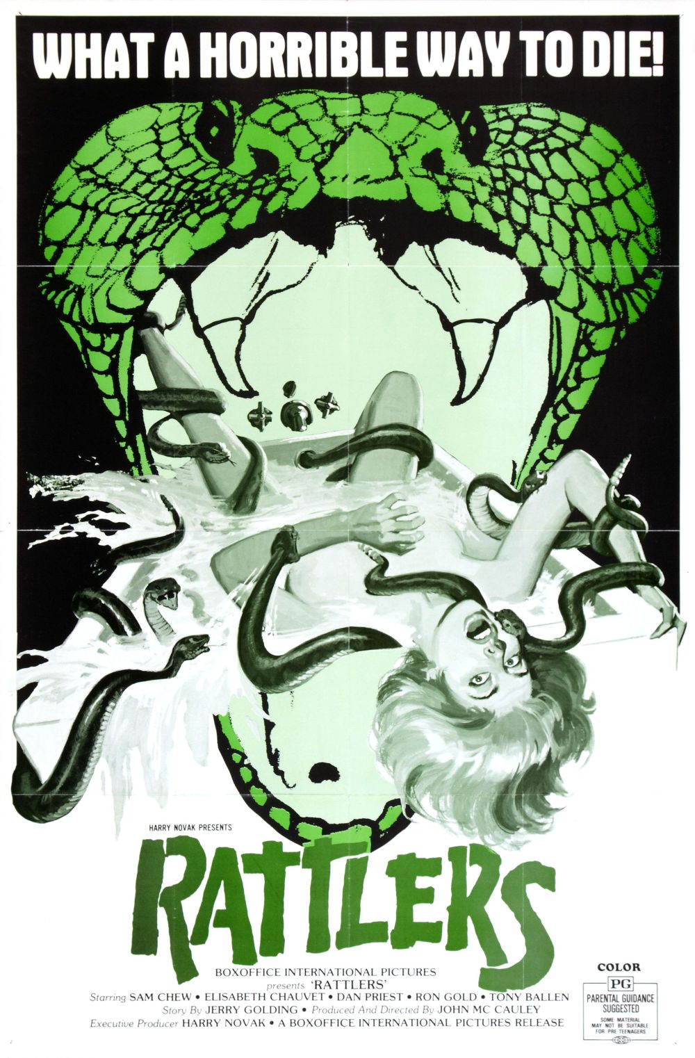
I think what fascinates me so much about this poster for Rattlers is the way it merges 50s illustrative design sensibilities with a distinctive mid-70s aesthetic. It has the effect of placing the film outside of time and place. The simple green/black/white colour palette is striking and allows the different elements to occupy a distinct place with the composition.


