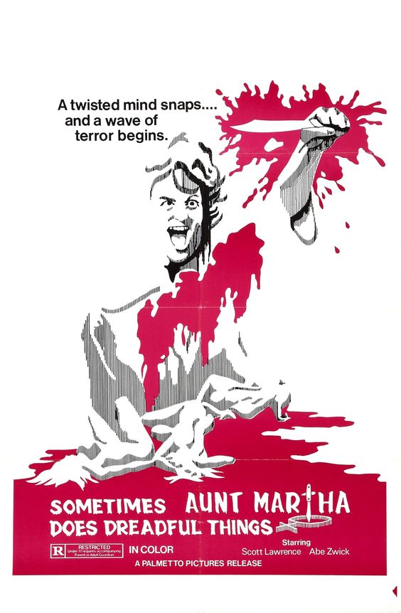
The poster for Sometimes Aunt Martha Does Dreadful Things is a perfect example of less is more. The imagery itself looks almost as though it has started to fade, with the only real focal point being the excess of blood red. Using such simplistic techniques result in a design I find genuinely unnerving.


